We started adding chart capability to the AYD Tool.
It's a very natural option when you start restructuring a table, usually a synthesized new version that contains insights.
A chart is able to convey such insights more quickly, so the option to swap between different representations is pretty obvious.
A table is just one visual representation that is very good for precise introspection of individual data points.
A chart, on the other hand, is very good at providing a glimpse of the bigger picture or quick comparisons.
Implementation Details
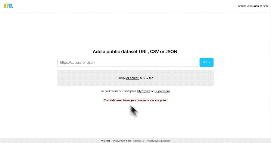
In AYD, everything starts with a Table component. You can then ask something and check if it's what you wanted in the first instance.
After that, you can swap to a compatible chart. There is some business logic to determine the chart model that can be used for a specific data frame.
In the future, the chart will have some options the user might change, such as:
- The metric/dimension they want to use (if there is more than one)
- The color or color scale they want to use
- Other chart elements they want to add (such as labels, tooltips, etc.)
So far, it’s very bare-bones, but it’ll be improved, of course.
Stay tuned!